Simple Redistribution Model
LAS Scott-Hayward
2025-03-20
Simple Spatial Redistribution.Rmd- Load data
count.data <- readRDS("data/nystedphaseA.rds")
count.data$response <- count.data$Count
panelid <- as.numeric(count.data$TransectID)
nysted.bndwf <- nysted.bndwf/1000
nysted.studybnd <- nysted.studybnd/1000
require(raster)
# 5km buffer, units are km
bndwf_buf<-data.frame(buffer(SpatialPolygons(list(
                Polygons(list(Polygon(nysted.bndwf)),ID = 1))), width=5)@
                polygons[[1]]@Polygons[[1]]@coords)
names(bndwf_buf)<-c('x.pos', 'y.pos')
detach(package:raster)- Fit Spatial Model
Let’s start simple by pooling all survey data and using no environmental covariates.
simplemodel <- readRDS("data/simplespatialmodel.rds")
simplemodel$call## gamMRSea(formula = Count ~ LRF.g(radiusIndices, dists, radii,
## aR) + offset(log(Area)), family = tweedie(var.power = 1.51918367346939,
## link.power = 0), data = count.data, splineParams = splineParams)
impdata.ny<-genChangeData(pct.change = c(20),
                          model = simplemodel,
                          data = count.data,
                          panels = "TransectID",
                          eventsite.bnd = bndwf_buf)
ggplot( NULL ) +
  geom_raster( data = rdf1 , aes( x , y , fill = pct.change ) ) +
  scale_fill_gradientn(colours=mypalette, values=c(0,1), space = "Lab",
                       na.value = "grey50", guide = "colourbar", name="Pct Difference") +
  theme_bw() + coord_equal() +
  geom_path(data = nysted.bndwf, aes(x.pos, y.pos)) +
    geom_path(data = bndwf_buf, aes(x.pos, y.pos)) +
  geom_path(data = nysted.studybnd, aes(x.pos, y.pos)) +
  xlab("Easting") + ylab("Northing")
## Warning: Raster pixels are placed at uneven horizontal intervals and will be shifted
## ℹ Consider using `geom_tile()` instead.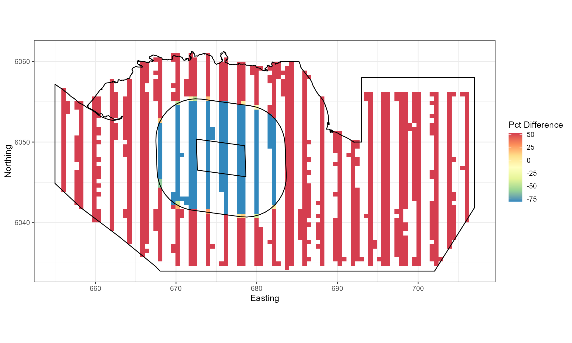
Figure showing the percentage change imposed for each grid cell.
ggplot() +
  geom_raster(data = rdf , aes(x , y , fill = Mean.count)) +
  facet_wrap(~evph) +
  coord_equal() +
  scale_fill_distiller(palette = "Spectral",name="Animal Counts") +
  geom_path(data = nysted.bndwf, aes(x.pos, y.pos)) +
  geom_path(data = bndwf_buf, aes(x.pos, y.pos)) +
  geom_path(data = nysted.studybnd, aes(x.pos, y.pos))+
  xlab("Easting") + ylab("Northing") + theme_bw()
## Warning: Raster pixels are placed at uneven horizontal intervals and will be shifted
## ℹ Consider using `geom_tile()` instead.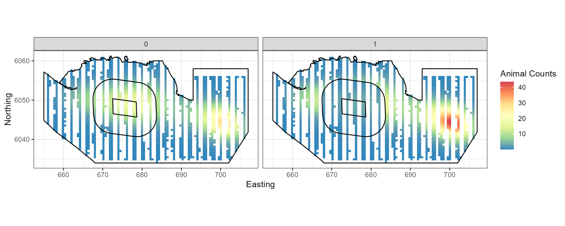
Figure showing the mean count for the baseline (0) and post impact (1).
nsim=500
# add noise
newdata.ny.imp<-generateNoise(nsim,
                              impdata.ny$truth, family='tweedie',
                               phi=summary(simplemodel)$dispersion,
                              xi = 1.52)
corrs<-getCorrelationMat(panel = impdata.ny$TransectID, data=impdata.ny$truth, dots = FALSE)

# quicker to do pre only and then bind the correlation matrices
corrs<-getCorrelationMat(panel = count.data$TransectID, data=count.data$Count, dots = FALSE)

# add correlation
newdatcor.ny.imp<-generateIC(data = impdata.ny,
                             corrs = rbind(corrs, corrs),
                            panels = 'panels',
                            newdata = newdata.ny.imp,
                            nsim = nsim,
                              dots = FALSE)
## Warning: package 'Hmisc' was built under R version 4.4.34) Update baseline model
To prepare for the power analysis, we must update the baseline model
to use the new data (newdatcor.ny.imp), the
eventphase term and the panel structure for the new data
(twice as many panels).
siminitial <- simplemodel
# update distance matrix to be duplicated (like the data)
siminitial$splineParams[[1]]$dist <- rbind(siminitial$splineParams[[1]]$dist,
                                           siminitial$splineParams[[1]]$dist)
siminitial<- update(siminitial,newdatcor.ny.imp[,1] ~.+as.factor(eventphase) -
                      LRF.g(radiusIndices, dists, radii, aR),
                    data=impdata.ny)
#siminitial$splineParams[[1]] <- NULL

salsa2dlist<-list(fitnessMeasure = 'BICtweedie',
                   knotgrid = siminitial$splineParams[[1]]$knotgrid,
                   startKnots = 5,
                   minKnots=4,
                   maxKnots=100,
                   gap=0,
                  interactionTerm = "as.factor(eventphase)") # ***

salsa2dOutput<-runSALSA2D(model = siminitial,
                          salsa2dlist = salsa2dlist,
                          d2k = siminitial$splineParams[[1]]$dist,
                          k2k = siminitial$splineParams[[1]]$knotDist,
                          panels =  impdata.ny$panels, # ***
                          suppress.printout = TRUE)
## Loading required package: fields## Loading required package: spam## Spam version 2.11-0 (2024-10-03) is loaded.
## Type 'help( Spam)' or 'demo( spam)' for a short introduction
## and overview of this package.
## Help for individual functions is also obtained by adding the
## suffix '.spam' to the function name, e.g. 'help( chol.spam)'.##
## Attaching package: 'spam'## The following object is masked from 'package:Matrix':
##
## det## The following objects are masked from 'package:base':
##
## backsolve, forwardsolve## Loading required package: viridisLite##
## Try help(fields) to get started.##
## Attaching package: 'fields'## The following object is masked from 'package:Hmisc':
##
## describe
simmodel <- salsa2dOutput$bestModel5) Power analysis
The power analysis takes each of the simulated data sets and re-fits the spatial model (with impact term included). Predictions are made from these models to the whole study region. At the same time, models are fitted to data where no change has been imposed (the null models).
data("nysted.predgrid")
nysted.predgrid <- nysted.predgrid %>%
  rename(Area = area) %>%
  mutate(Depth = abs(Depth),
         x.pos = x.pos/1000,
         y.pos = y.pos/1000)

predictdata<-rbind(data.frame(nysted.predgrid[,2:8], YearMonth='2001/2',
                              Area=nysted.predgrid$Area, eventphase=0),
                   data.frame(nysted.predgrid[,2:8], YearMonth='2001/2',
                              Area=nysted.predgrid$Area, eventphase=1))

g2k <- makeDists(predictdata[,c("x.pos", "y.pos")],
                 knotcoords = simmodel$splineParams[[1]]$knotgrid,
                 knotmat = FALSE)$dataDist
powerout.nysted.re<-powerSimPll(newdat = newdatcor.ny.imp,
                                model = simmodel,
                                empdistribution = empdistpower.ny,
                                nsim=nsim, powercoefid=length(coef(simmodel)),
                                predictionGrid=predictdata, g2k = g2k,
                                n.boot=10, nCores = 2)
## Loading required package: mvtnorm##
## Attaching package: 'mvtnorm'## The following objects are masked from 'package:spam':
##
## rmvnorm, rmvt## Loading required package: parallel## Code in parallelCreating Outputs...
null.output.nysted.re <- pval.coverage.null(newdat.ind=newdatcor.ny.imp,
                                      newdat.corr=NULL, model=simmodel, nsim=nsim,
                                      powercoefid=length(coef(simmodel)))
The power to detect the redistribution of birds in this example is 77.6666667.
summary(powerout.nysted.re, null.output.nysted.re)##
## ++++ Summary of Power Analysis Output ++++
##
## Number of power simulations = 300
## Number of no change simulations = 150
##
## Power to select 'change' term (redistribution term):
##
## Under Change (true parameter = unknown) = 77.66667%
## Under no change (true parameter = 0) = 12%
##
## Overall Abundance Summary with 95% Confidence Intervals:
##
## Abundance LowerCI UpperCI
## Before 4858 3860 6063
## After 4650 3622 6026
##
## Note: These calculations assume the correct area has been given for each prediction grid cell.
powerPlot(powerout.nysted.re)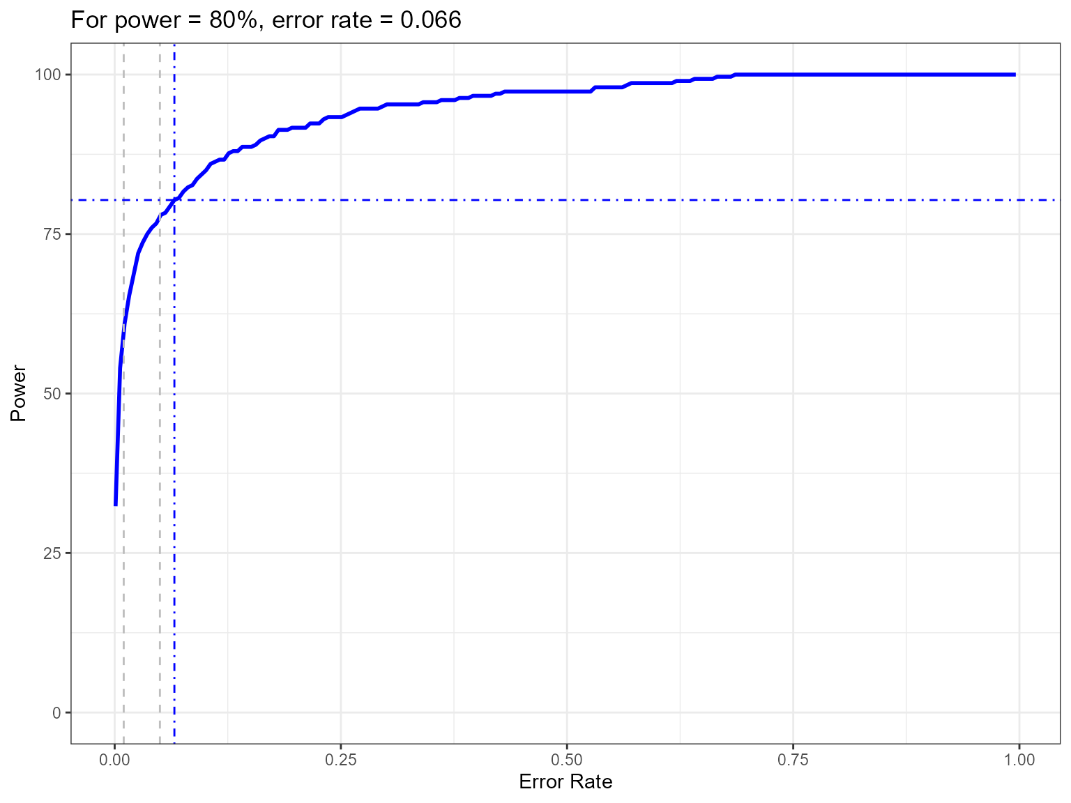
Figure showing how the power to detect change varies with the error rate chosen. The first grey dashed line is at 1% and the second at 5%, traditionally values used as -value cutoffs. The blue dashed lines indicate the error rate required to get a power of 80%. The value is given in the title.
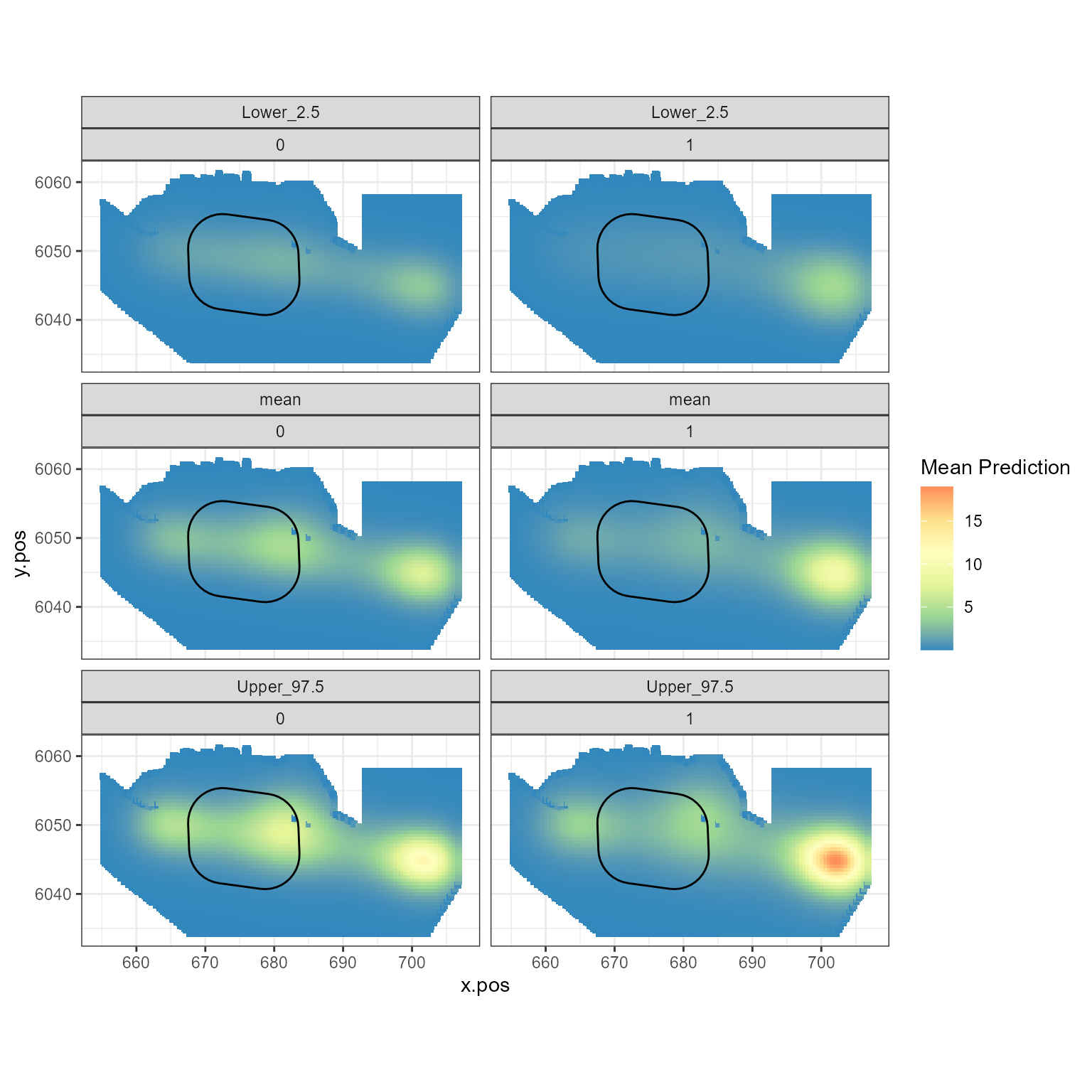
Figure showing the mean (middle), lower 2.5% (top) and upper 97.5% (bottom) of predicted animal counts before (left) and after (right) the event.
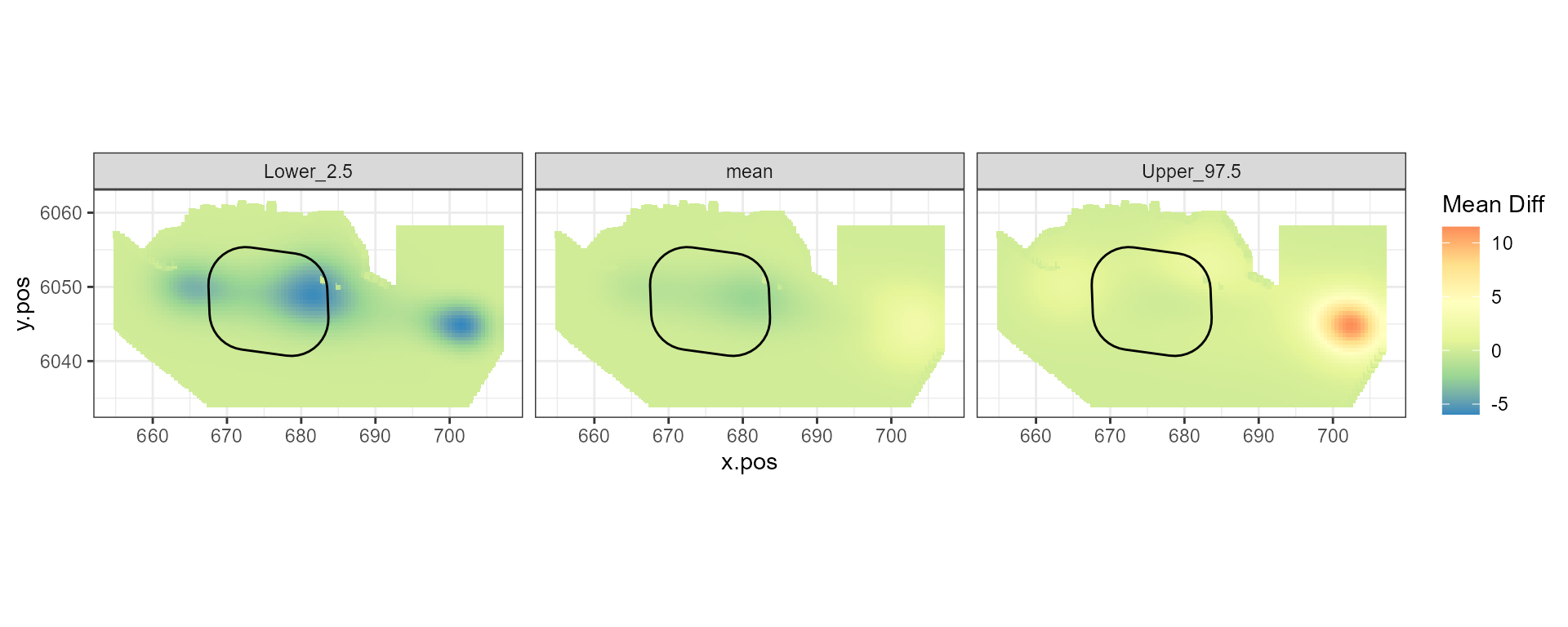
Figure showing the mean (middle), lower 2.5% (left) and upper 97.5% (right) of estimated differences between before and after the event. (difference = post - pre)
## Scale for fill is already present.
## Adding another scale for fill, which will replace the existing scale.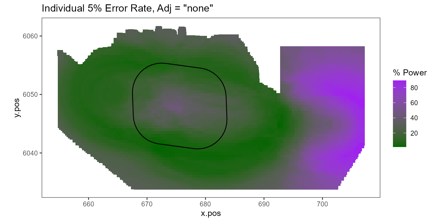
Figure showing, for every grid cell, the proportion of simulations that showed a significant difference.