Plotting function to assess the mean of generated data
plotMean.RdPlotting function to assess the mean of generated data
Usage
plotMean(model, simdat, bins = 15, quants = c(0.025, 0.975))Details
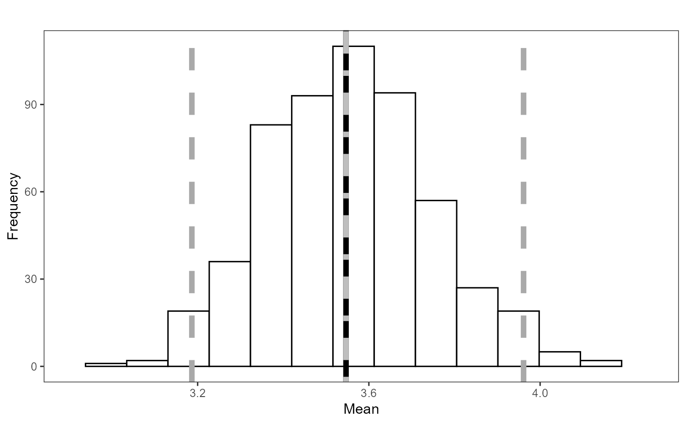
The histogram returned shows the lower 2.5 and upper 97.5 quantiles (dark grey, long dash lines) for the mean. The grey solid line is the mean of the fitted values from the inputed model. The black short dashed line is the mean of the response data.
Examples
data(nystedA_slim)

initialModel<-MRSea::gamMRSea(response ~ 1 + as.factor(yearmonth)+depth +
                     x.pos + y.pos + offset(log(area)),  data=nysted,
                     family=quasipoisson)

nsim<-550
d<-as.numeric(summary(initialModel)$dispersion)
newdat<-generateNoise(nsim, fitted(initialModel), family='poisson', d=d)

plotMean(initialModel, newdat)
#> Warning: Removed 2 rows containing missing values or values outside the scale range
#> (`geom_bar()`).